


Designing a CAD interface requires many elements and approaches. Dispatchers want an easy-to-use platform; PSAP managers value the completeness of information and procedures. Most CAD UI try to fit all the information in one screen, creating an abundance of data that is difficult to read.
The answer is to create a tool that can change and adapt to different needs. In over 30 years of setting up PSAPs and developing our Life 1st platform we found five key elements to consider when designing a CAD UI. The interface must be:
-
Comprehensive (display all useful data)
-
Flexible (adapting to process)
-
Responsive (changing shape)
-
Focused (logic display of data)
-
Accessible (be used in long shifts)
Design Thinking: our starting point

For the design elements, Beta 80 Group turned to one of Italy's best design companies: DGI Group, who had knowledge of the elements and tools needed to create an intuitive, clear and complete platform.
We employed the Design Thinking methodology: a problem-solving approach that values user needs, observing how people interact with environments. The iterative process made it possible to empathize with the user, challenge assumptions and redefine problems, to identify alternative strategies and solutions.
So what was Beta 80's path in CAD interface design?
Beta 80 started by mapping the user's needs and requirements and thinking how best to display all elements to make the interface clear, complete and functional. This process required several steps: the knowledge phase, in which the user is empathized and problems and objectives are defined, the exploration phase, in which ideas are hypothesized and the first prototypes are created, and the implementation phase. where solutions are tested and implemented.
The knowledge phase: empathizing and defining problems.
Design Thinking played a vital role in the entire product development cycle and in the daily problem solving activities. The methodology offers a different approach to critical issues. It allowed to redefine and understand the needs, finding a harmonious and rational way to include the different solutions in the CAD platform. The knowledge phase was divided into the following steps:
Empathize: research and focus on the user's needs. Empathy is key in design, as it forces you to put your assumptions aside and allows you to get information from users.
Analyze: Reorganize all information from the user's point of view
The exploratory phase: ideate and prototype
Because of our thirty year experience, we are aware one must never settle but always find ways to evolve and go beyond what are the technologies of the moment.
However, relying only on experience is not enough; customers mature and it is important to think about the product with innovative hypotheses and solutions. For a fresh start, we decided to include as many people as possible in our design brainstorming sessions as the best ideas come from unexpected places.
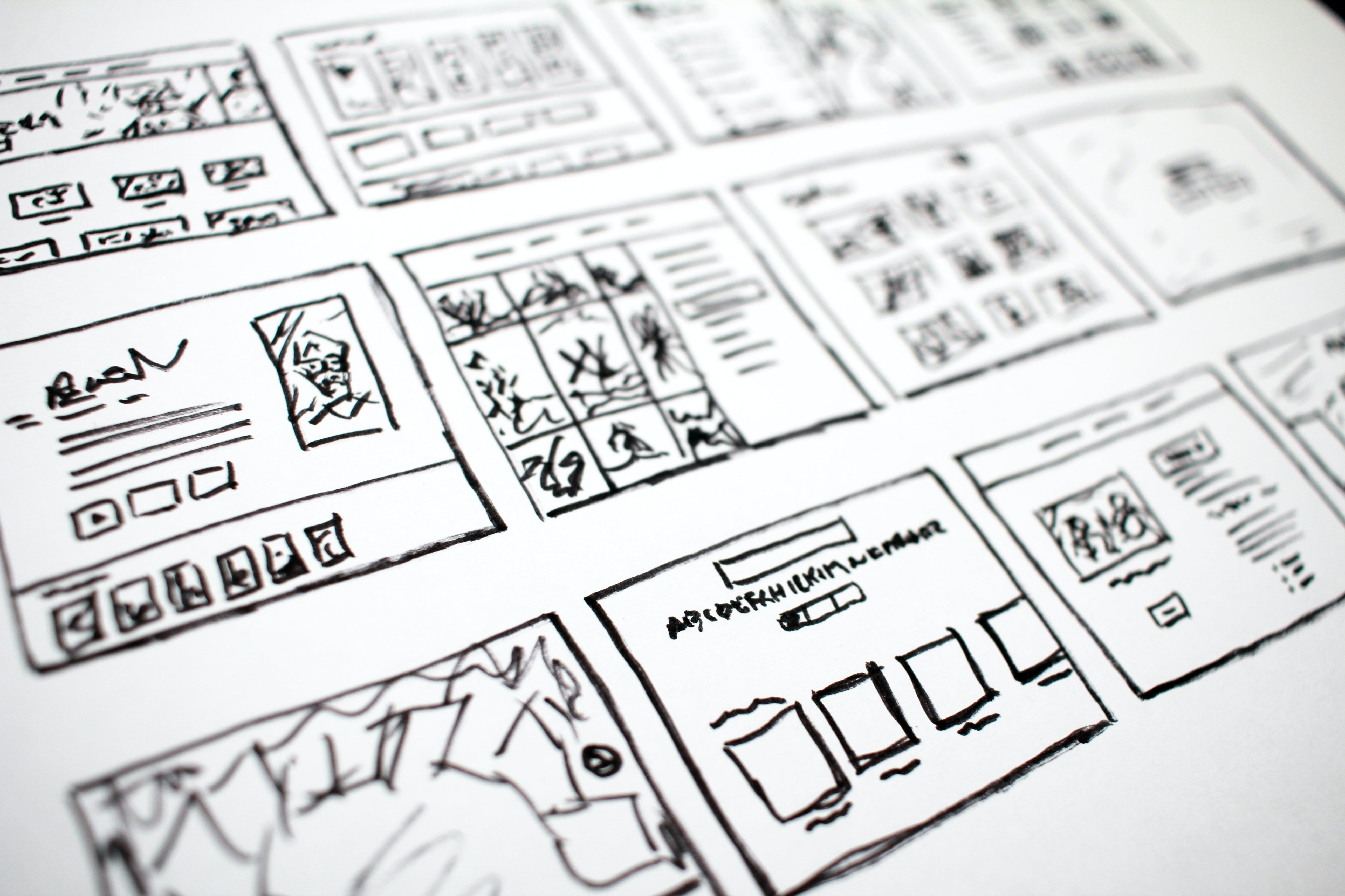
After brainstorming, we created a few prototypes. We started with simple layouts on paper, sketching flows and processes and the graphic aspect. At this stage it was important to write down thoughts as quickly as possible to be evaluated and understood. We then shared our solutions and ideas with end users for their feedback. Once we had a convincing solution in draft we moved on to the realization.

The material phase: testing and implementation
The third phase involved putting the ideas into practice. After the design thinking methodology exercise, we selected the tools and technologies to build it. We looked at several portals and instruments and decided on Microsoft Fluent UI as the environment to fulfill our five CAD interface pillars.
We went from some guidelines describing the framework to the real deal. To start, we kept the overall framework requirements and parameters. We were then able to use our thirty-year experience to design and improve certain elements. Other elements were reshaped (es. Tab subdivision of complex data). The end goal was to change from the huge complex window to something clearer and more intuitive.
We went beyond the information display by understanding what the meaning behind the information was and how users needed to access it based on the compiling flow. All in all, we looked to reorganize the information in a different layout.
The new Interface: some examples

The key for our Life 1st interface was keeping the user focused on one action at a time by having the full set of information in the background, easily switchable. Information is displayed with different elements that help readability. Badges and colors are used to highlight changes in data and call attention to the different levels, as well as their importance.
These visual elements are key in quickly reporting and visualizing information. Even though this interface is closer to a B2B model interface, the layout with badges, pop-ups, and colors resembles the main platforms that dispatchers use outside of work, for example, social media or search engines.
This makes it more pleasurable to use for many consecutive hours. It also makes it more intuitive, as it conforms to a model with similar codes for reading and interpreting the data (es. A new alert might come in the form of a red circle with the number one on it). This new layout had the perfect balance between readability and the quantity of data. Improving user experience and performance quality.

Other key elements are words, icons in the buttons. We simplified the navigational experience by introducing buttons with mixed words and icons. For some easy-to-understand functions (ex. Print) we took the words out, clearing the space in the window and making the visual lighter and more pleasurable, for some other functions, such as “dispatch” we could not do this and used the word. Sometimes a label is more effective than an icon in conveying meaning. Colors and shapes can also be used to help convey priority, meaning, and information, improving readability.

Every element needs a purpose and each detail was studied thoroughly: the length of a button, the icon, the position, the priority, the fonts were all analyzed to come up with the best possible version. For example, all buttons are contextualized on the screen and are always in the top right corner. When a user manages an incident, they automatically know that the function is on the top right corner.
This placement helps find patterns that can be interiorized and automated, quickly retrieving the information. It prevents the eyes from aimlessly wandering around the screen to find where an item may be placed. A single spot holds all the information.
The User Interface: flexibile and adaptable
Designing a functional CAD interface is not only a matter of design and usability; it needs to follow the customer process management requirements. We were aware that the CAD needed to adapt to different agencies’ processes and procedures.
A first-level PSAP interface will focus on caller location, call sources, (such as AML, eCall, apps and phone), and incident qualification. A second-level PSAP needs to focus on the interview, dispatch, and event module. The CAD software is the same, but it needs to quickly readapt to the need of each agency.
Lastly, the CAD must be interactive to rearrange itself based on the selected data, reconfiguring in real-time to display the most appropriate function based on the previous input and choices. By changing the parameters, you have the best interface for your needs.
The Future: A Common International Standard for CAD Interface?
As of today, there are no standards, just of some components that need to be common to all CAD platforms. EENA did publish some guidelines, but we are far from a common standard adopted by all. Unfortunately, it is hard to define as every agency is different in terms of people, procedures, and needs.
A set of structured guidelines would be more helpful in supporting agencies to understand best practices and methodologies coming from the emergency community. These would help make the switch in providers easier, as users do not need to relearn how to use the software every time the contract ends.
This article is an abstract from one of the presentation on the NEW CAD Webinar series. All videos, powerpoint presentations and materials are available at the link below.


